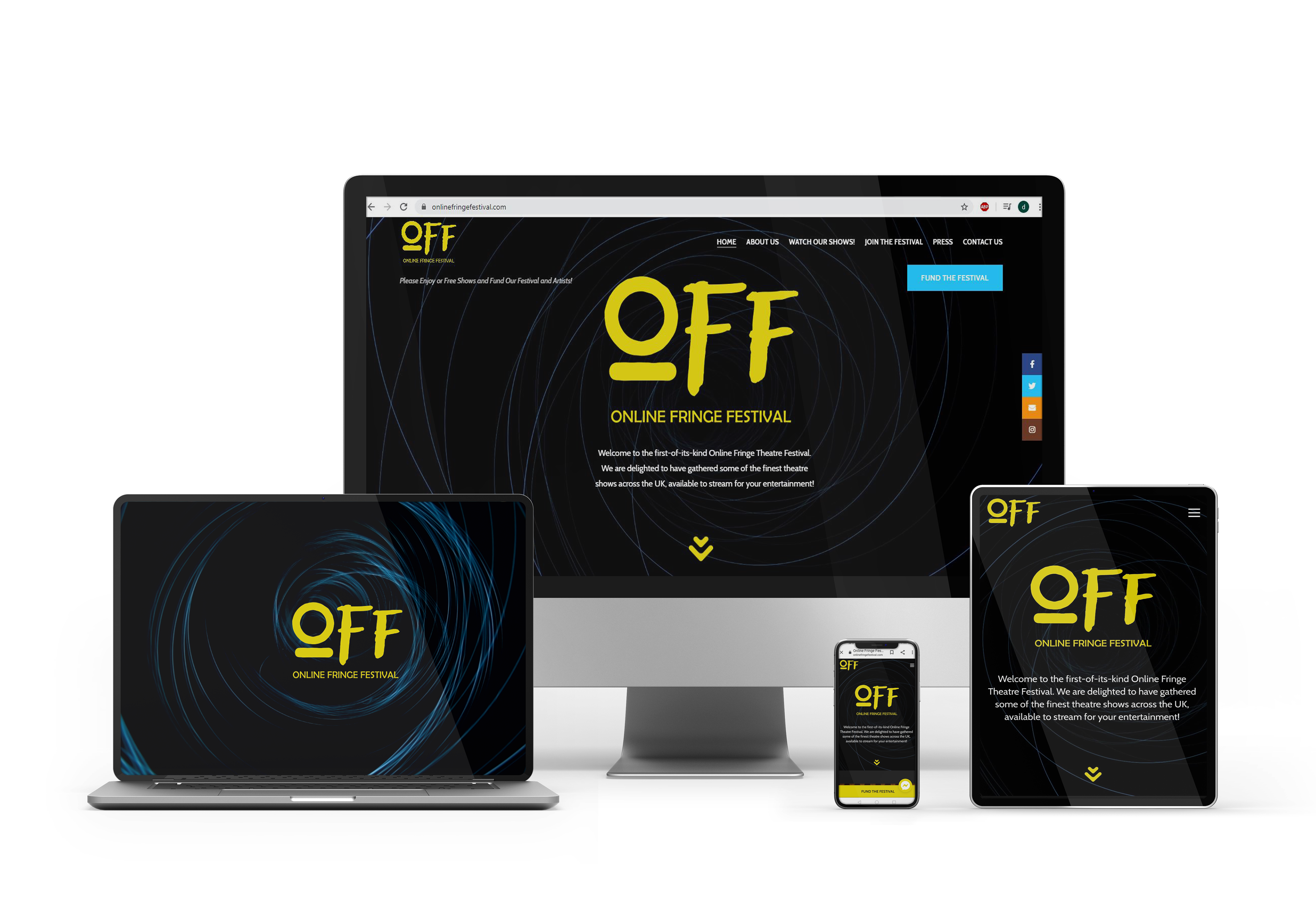
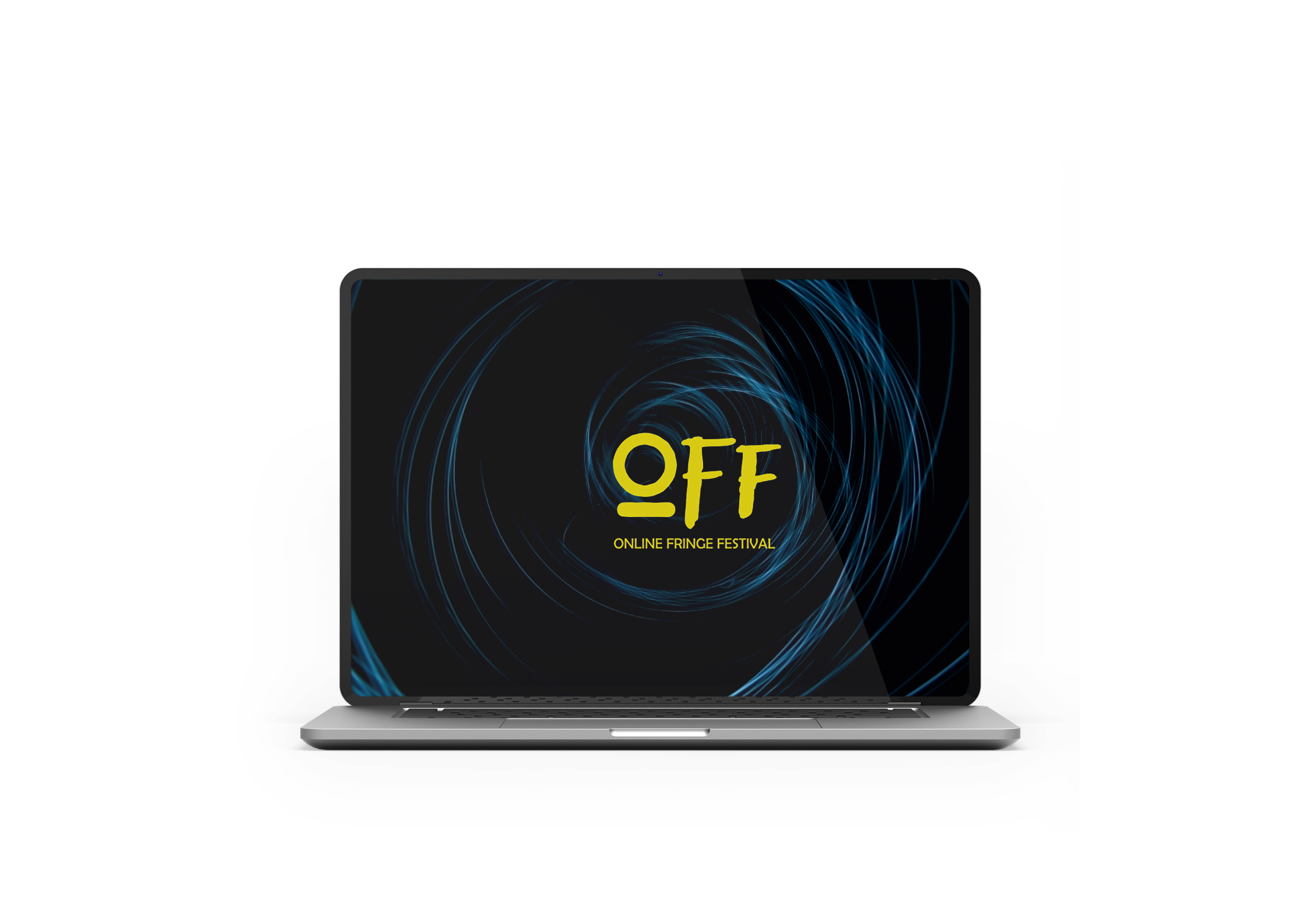
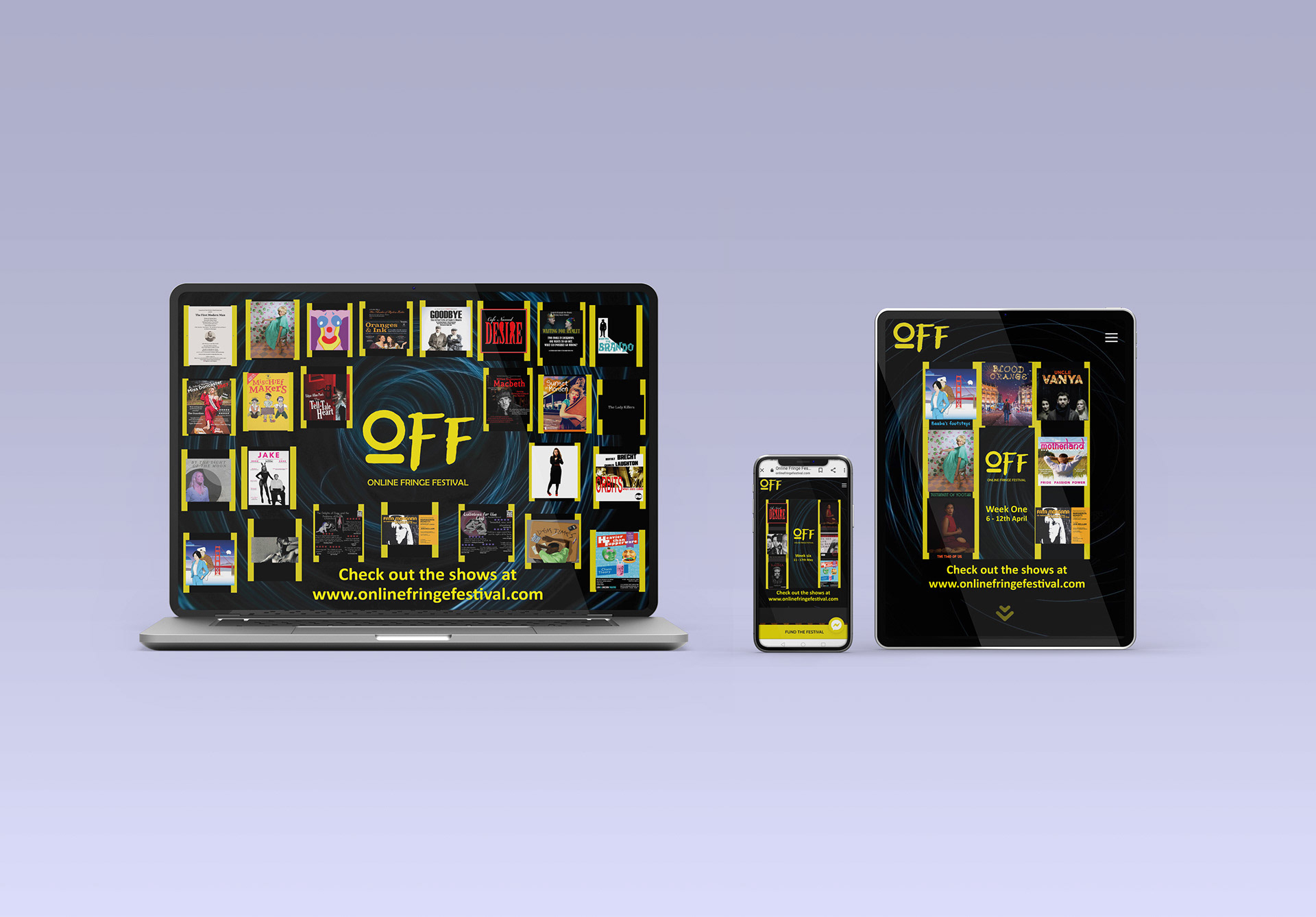
OOF- AWARD WINNING ONLINE FRINGE FESTIVAL
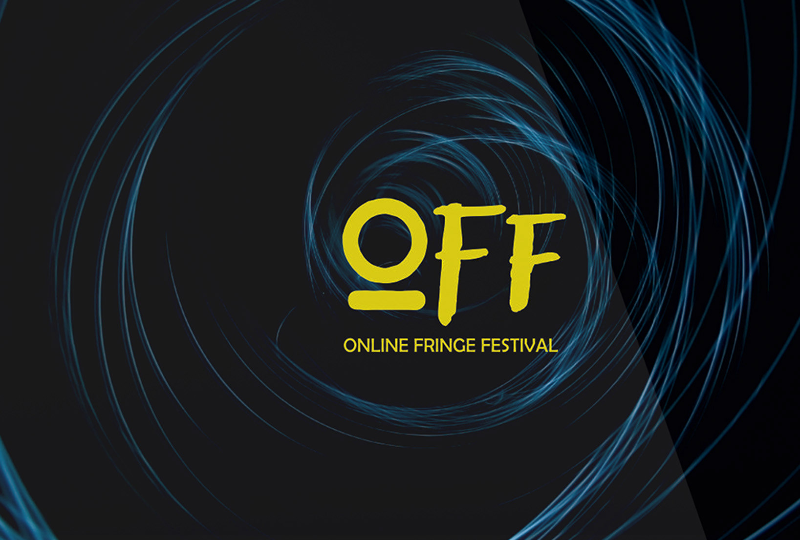
During the pandemic, a passionate team revived theater online, launching The Online Fringe Festival to remind us of theater's vital presence. I found the "old growth" font's simplicity resembling a power button, paired it with PANTONE 605 C for stage-like lights, symbolizing hope and vitality for the theater world.
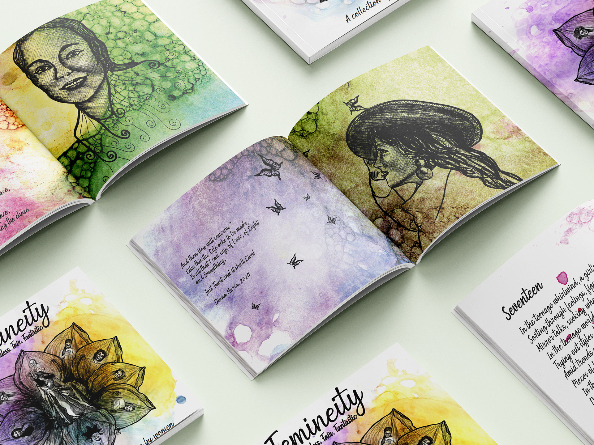
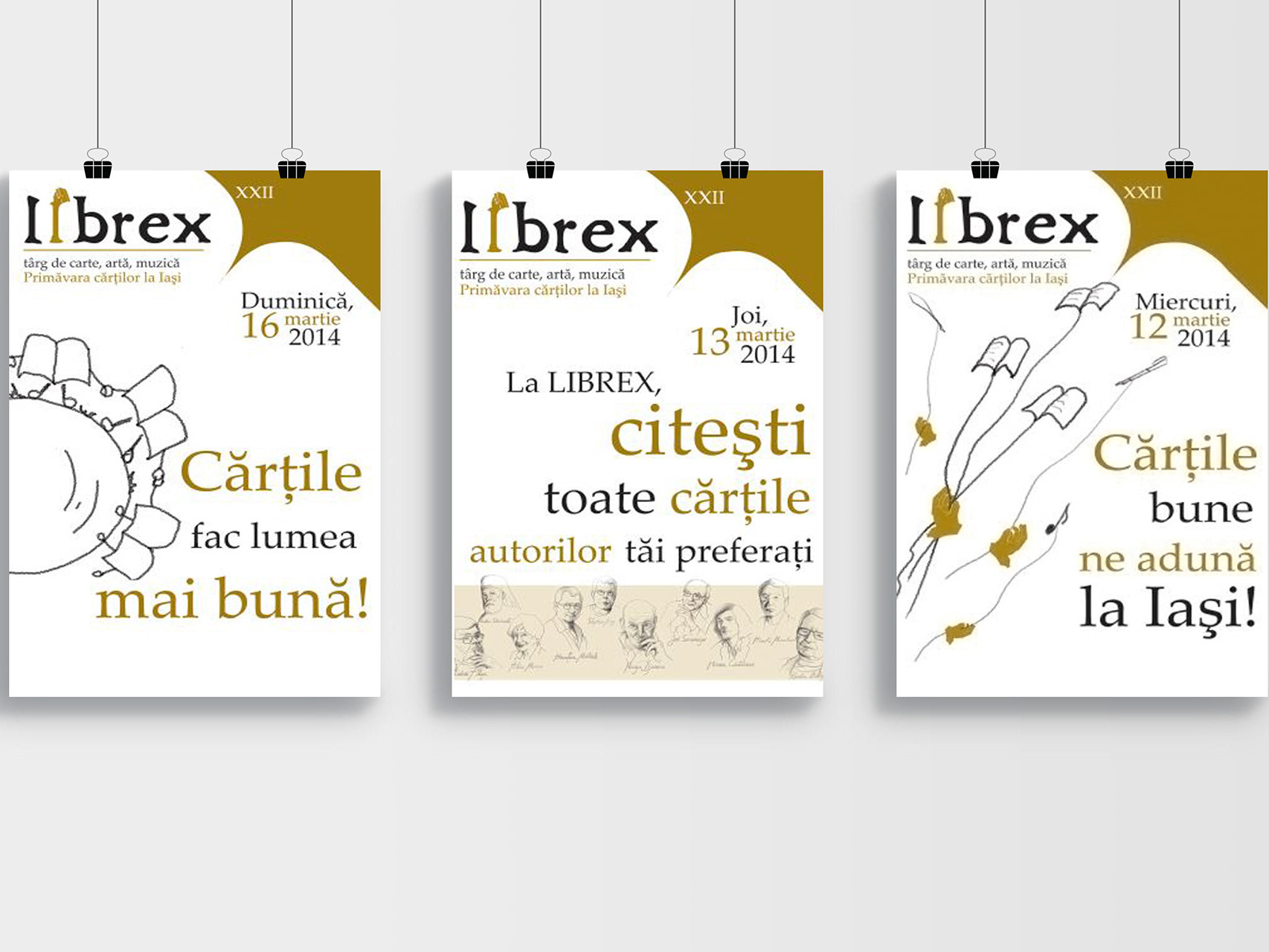
BOOK FEST IDENTITY
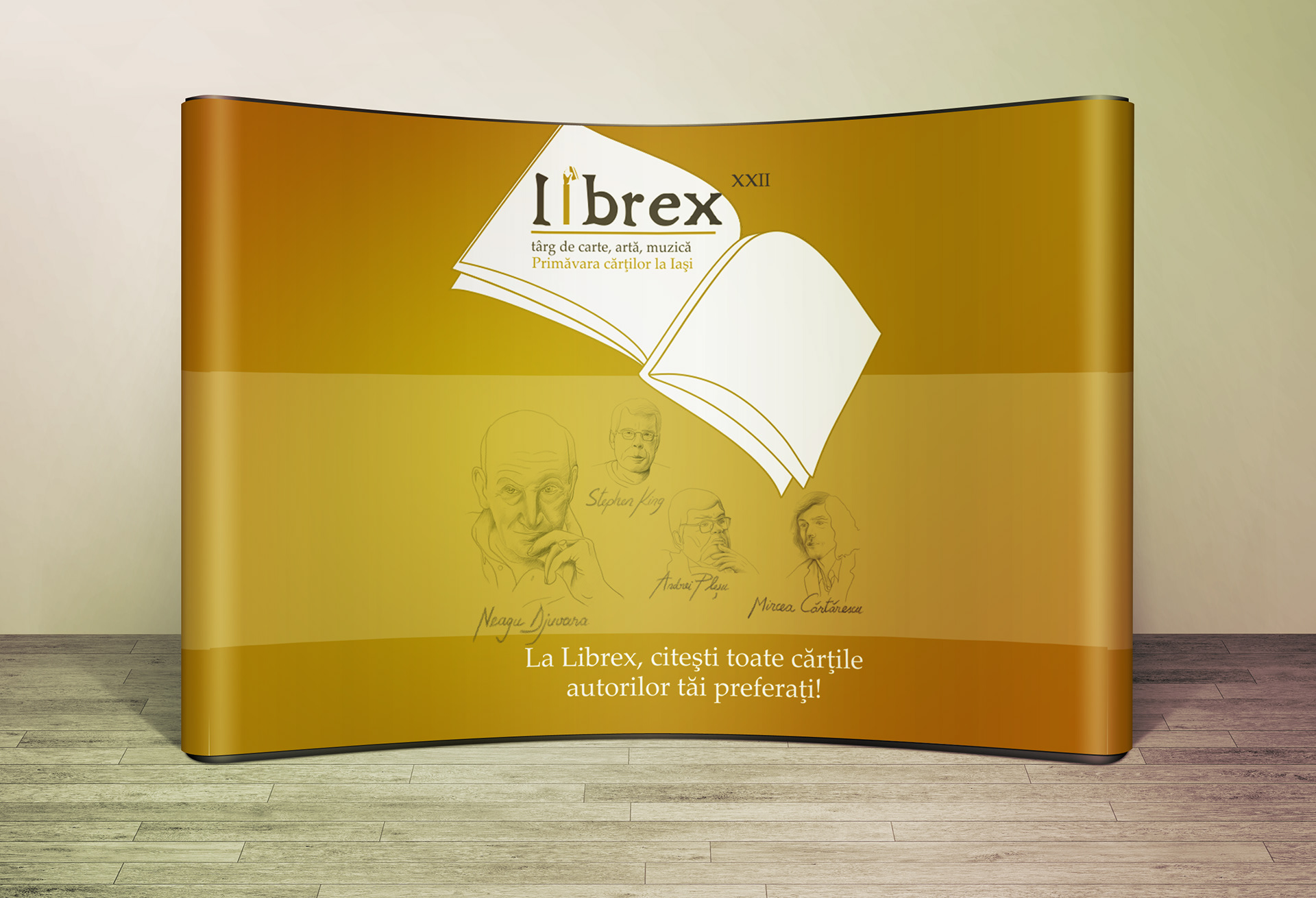
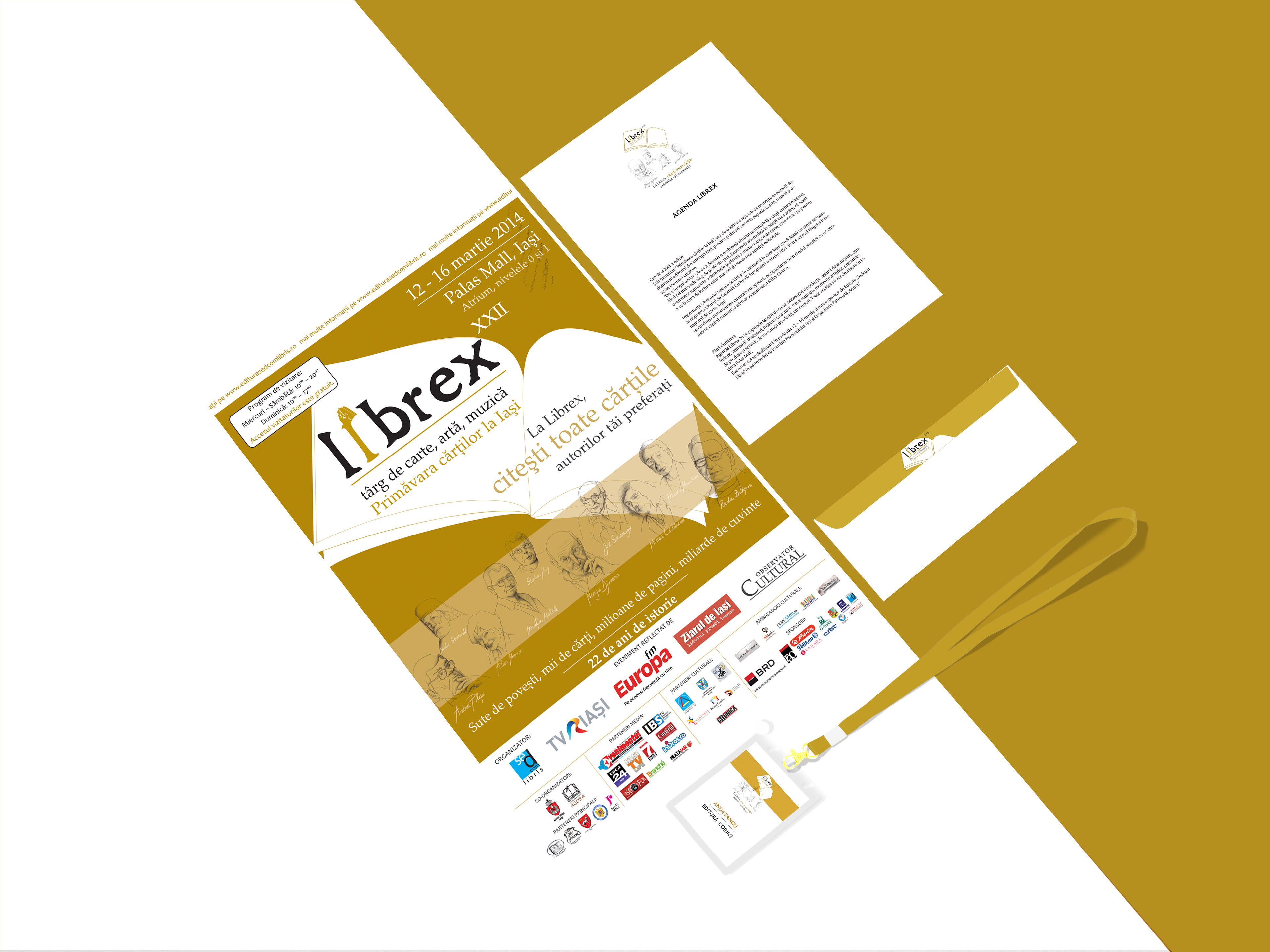
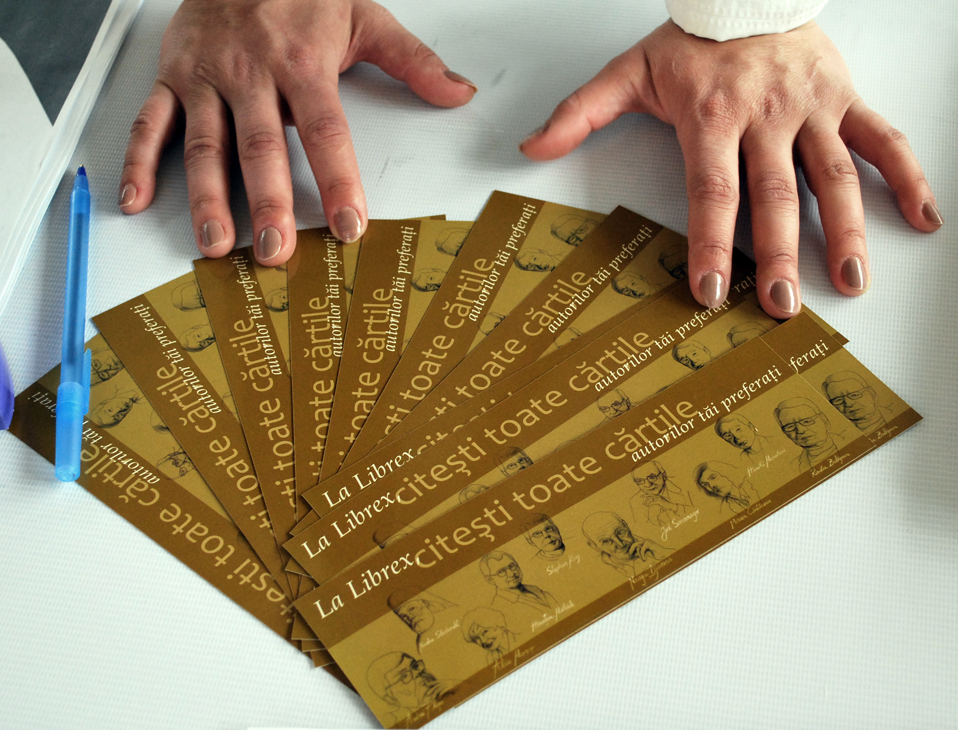
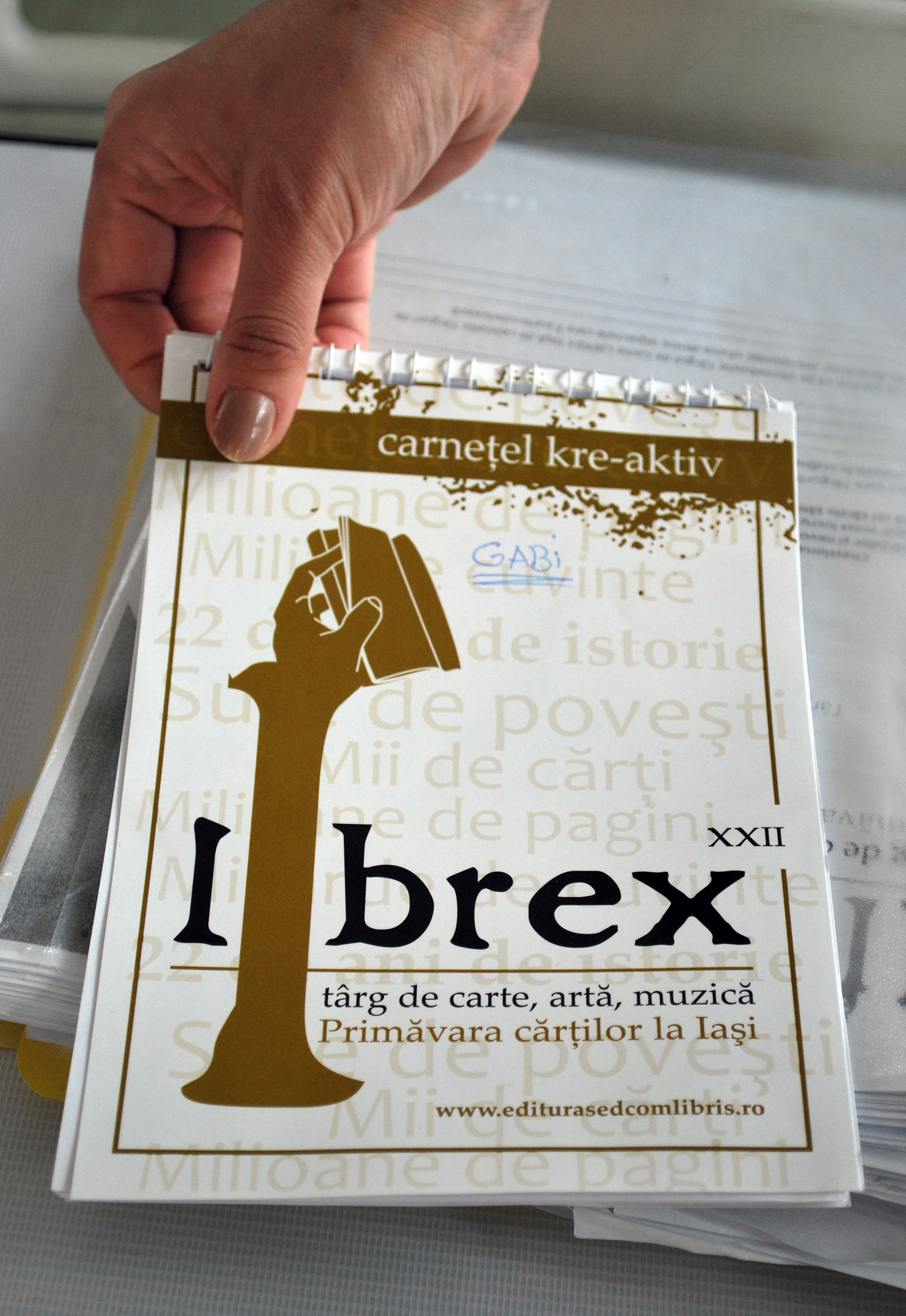
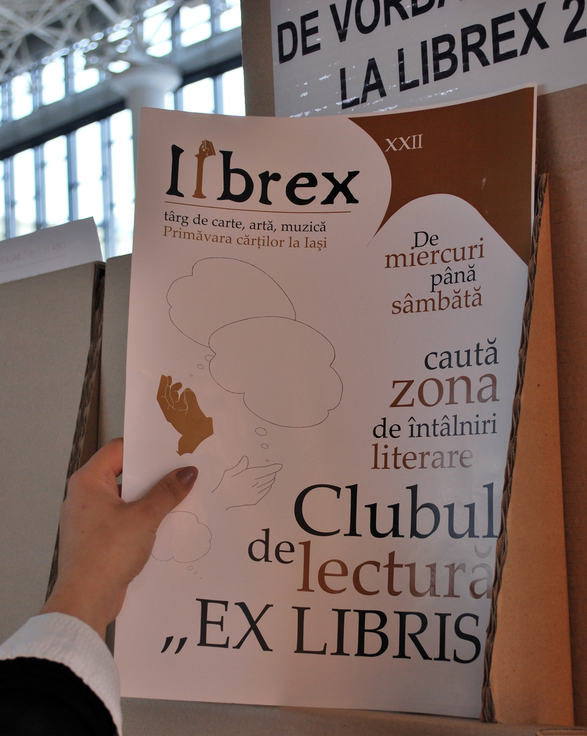
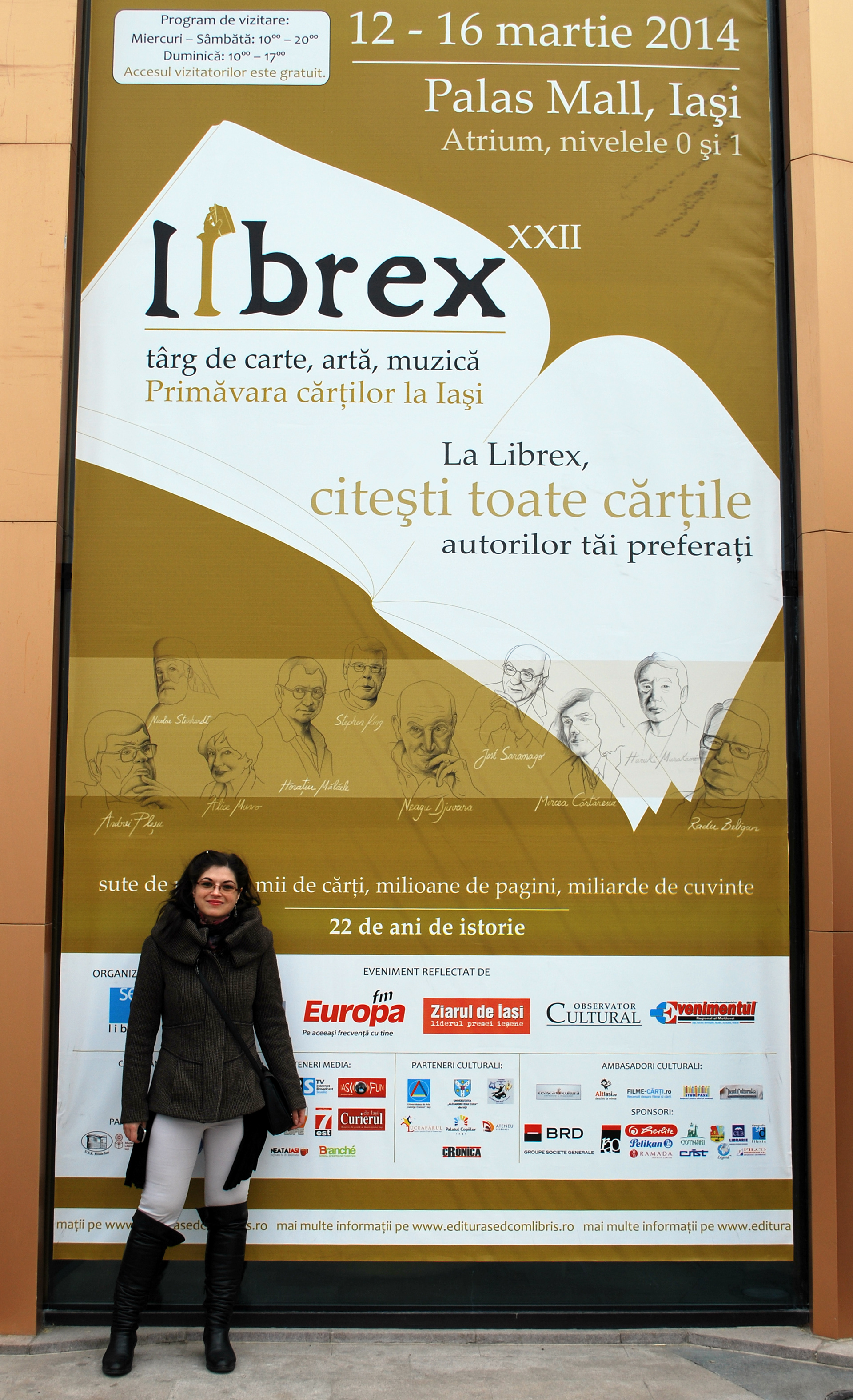
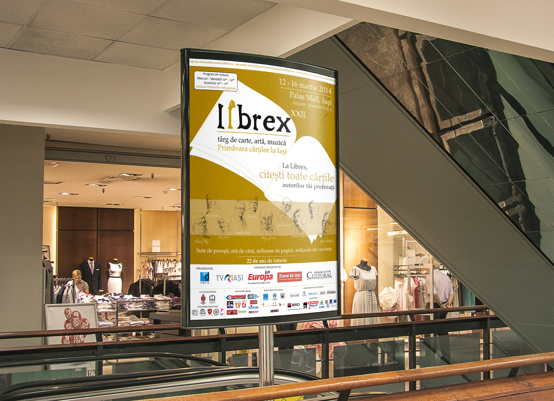
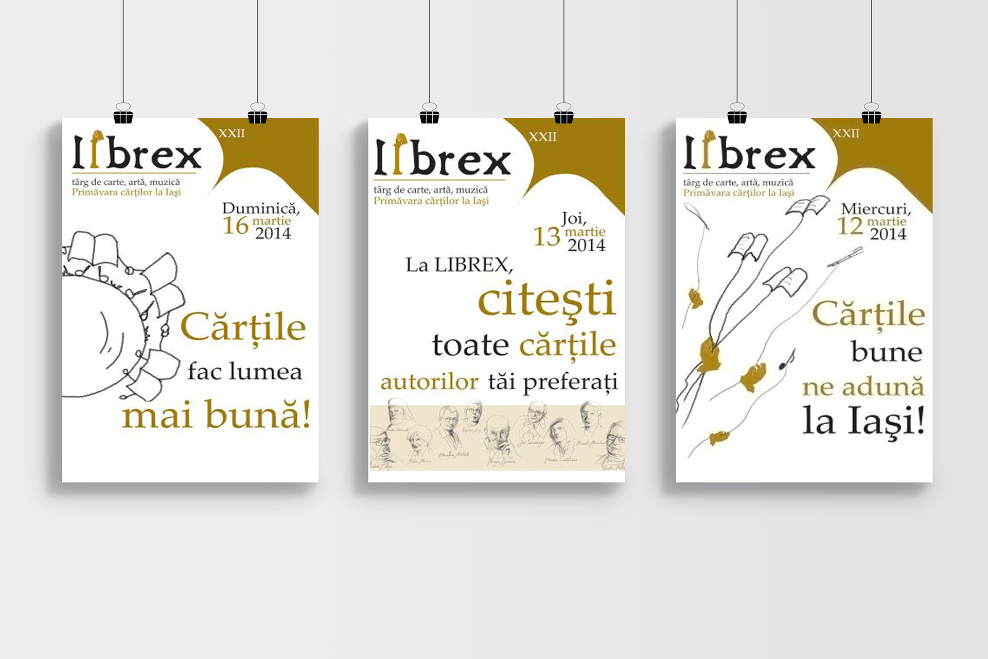
I led the design for the 22nd Librex book festival in 2014, crafting an image embodying its spirit. Our chosen design showcased a hand holding a book, symbolizing reader involvement. With graphite portraits of writers on a refined PANTONE 1245C backdrop, the visual identity captured the event's interactive essence. It's among my top achievements, and the outcome left me pleasantly speechless.
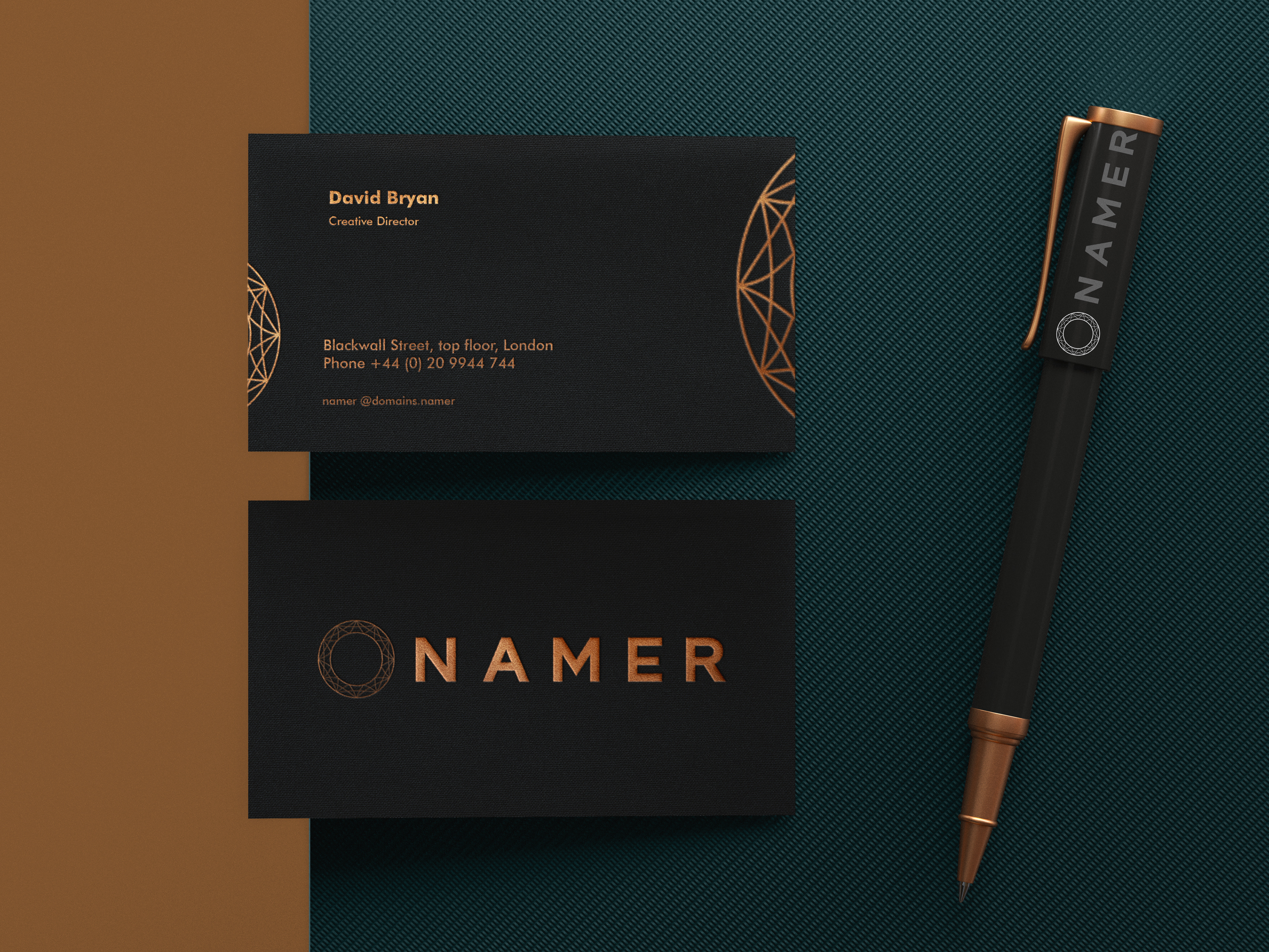
NAMER
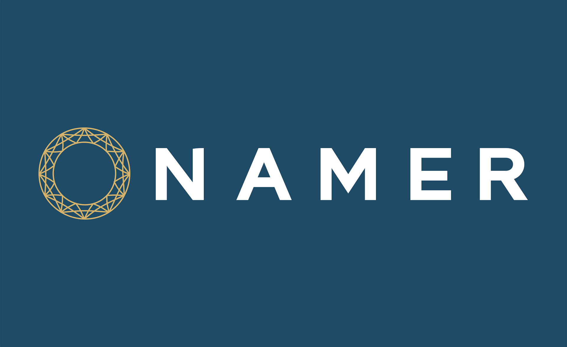
Creating this identity aimed to visually capture global data collection and innovation, reflecting inclusivity and connection. The design embodies a dynamic spirit with interconnected lines and vibrant colors symbolizing diverse sources contributing to a rich pool of information. Bold typography and modern shapes signify forward-thinking innovation in line with the client's tech leadership vision.

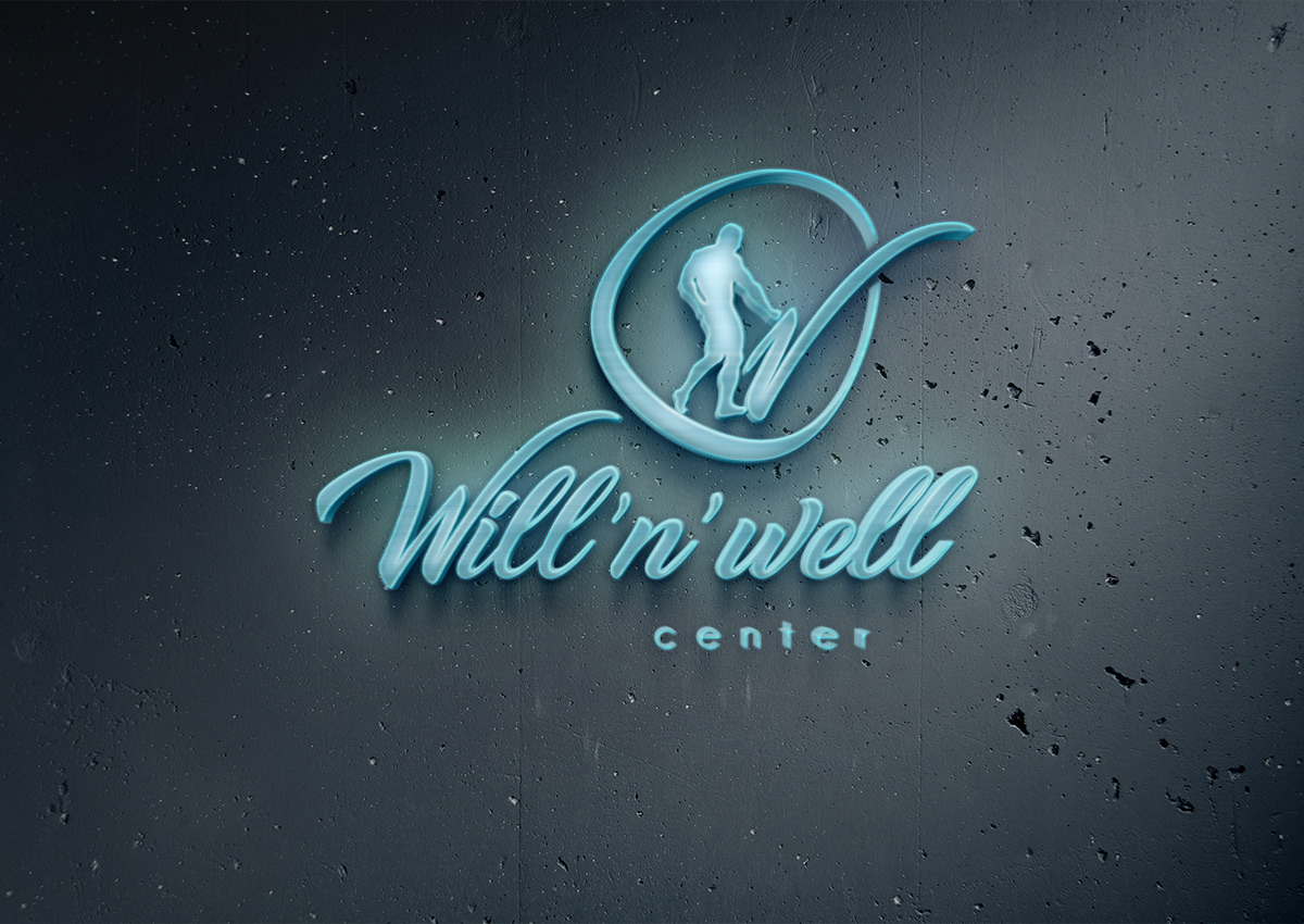
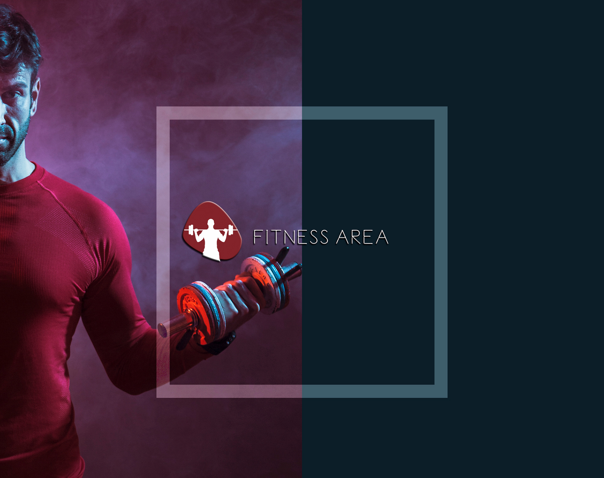
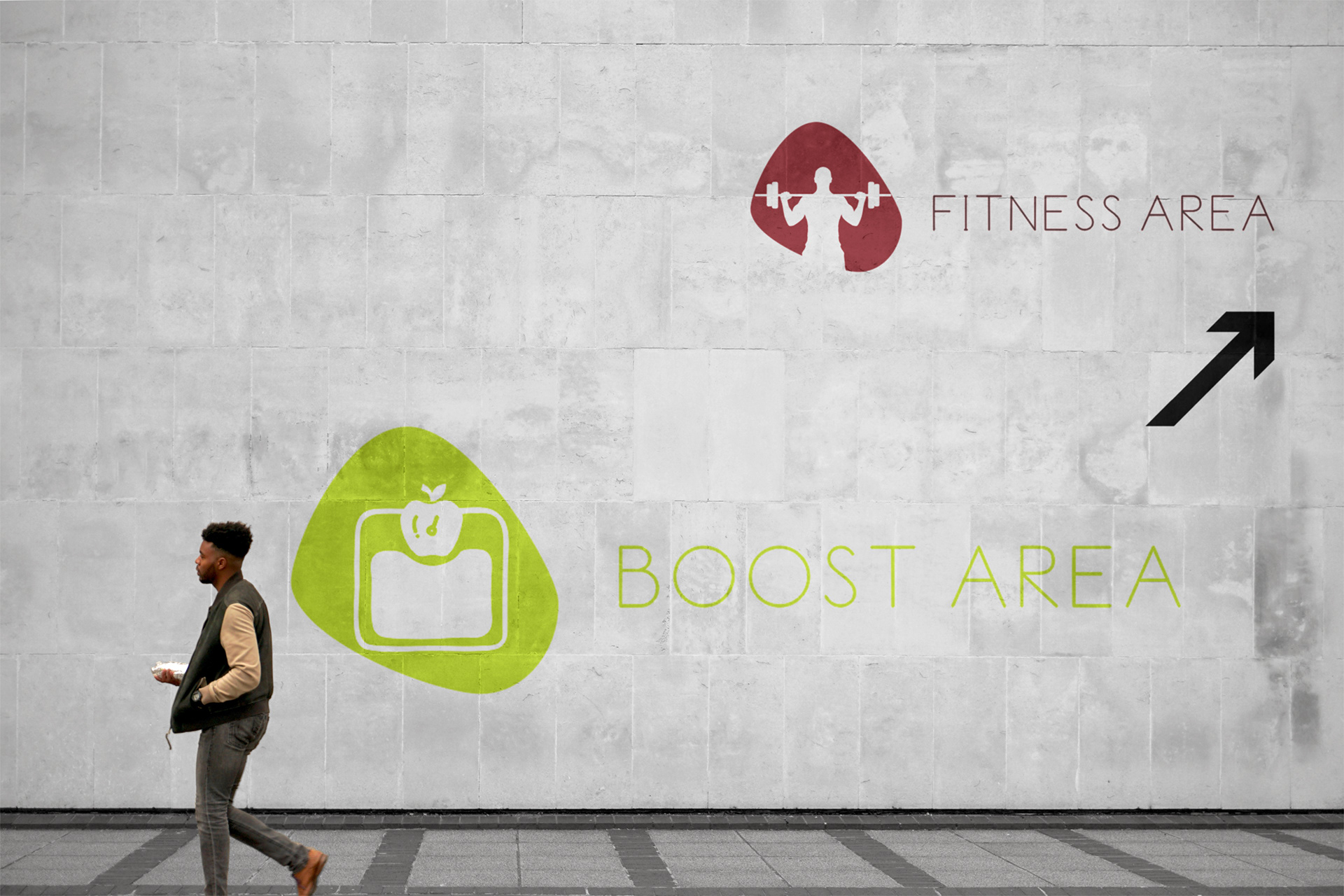
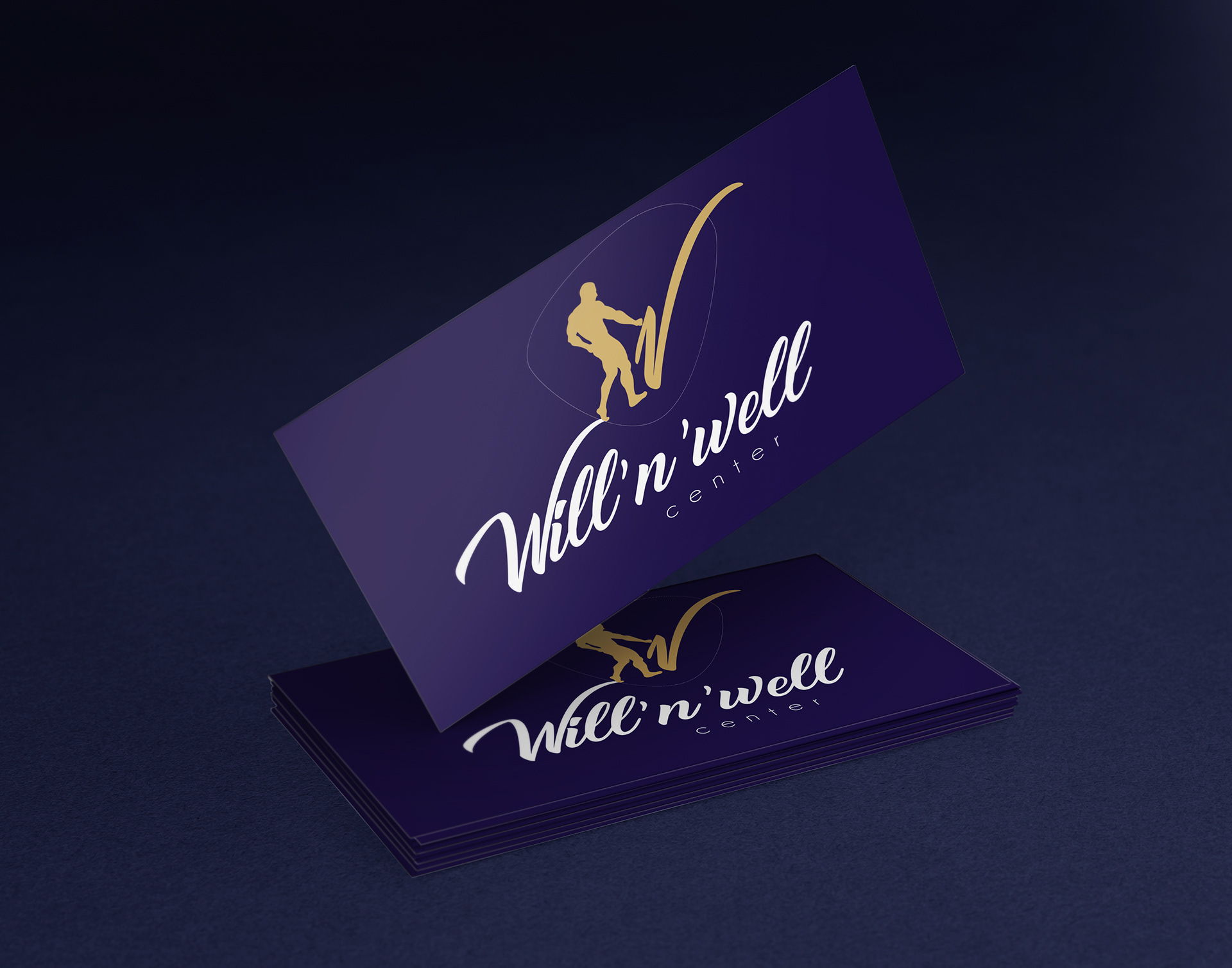
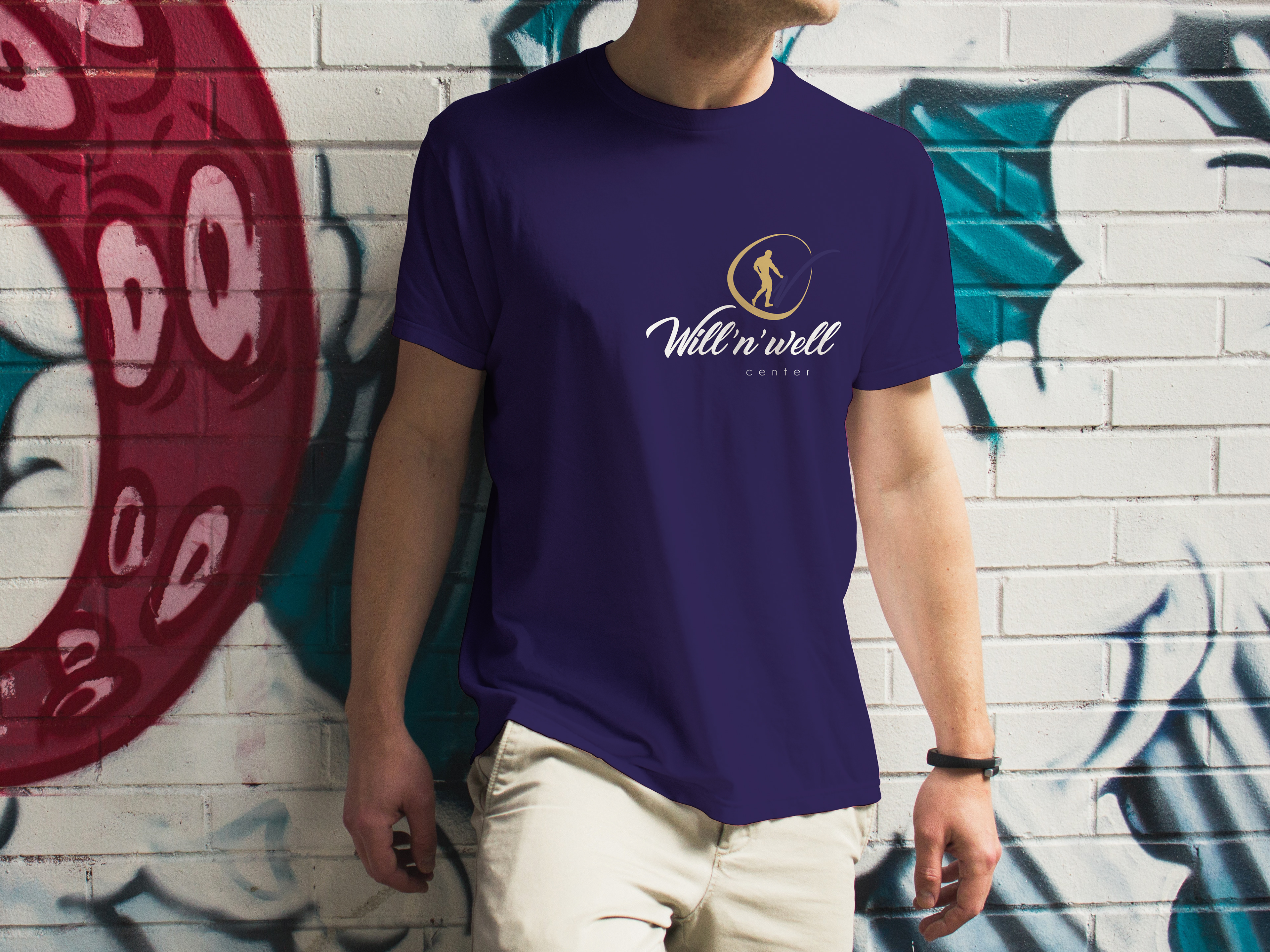
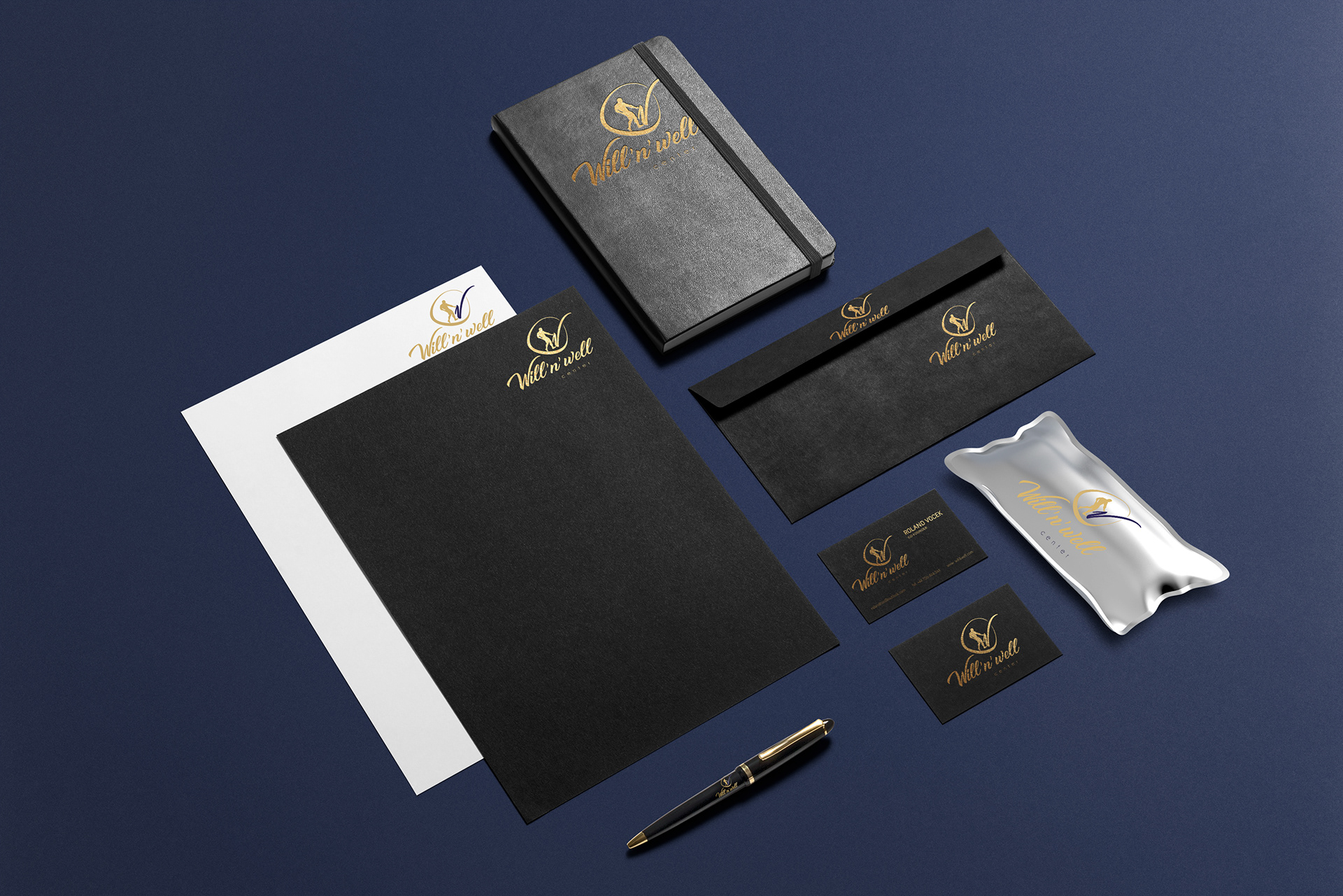
WILL&WELL
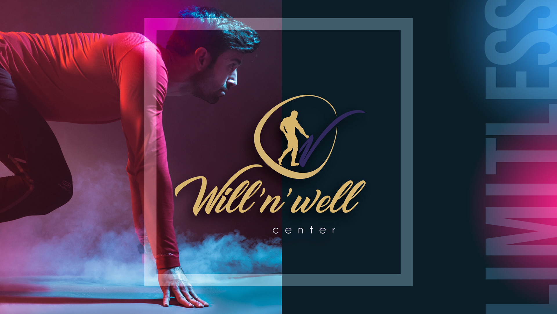
In shaping this identity, my aim was to visually capture the diverse, multicultural spirit of this wellness center. It was designed to provide a holistic representation of a space encompassing a gym, spa, workspace, healthy food court, and meditation and recovery zones.


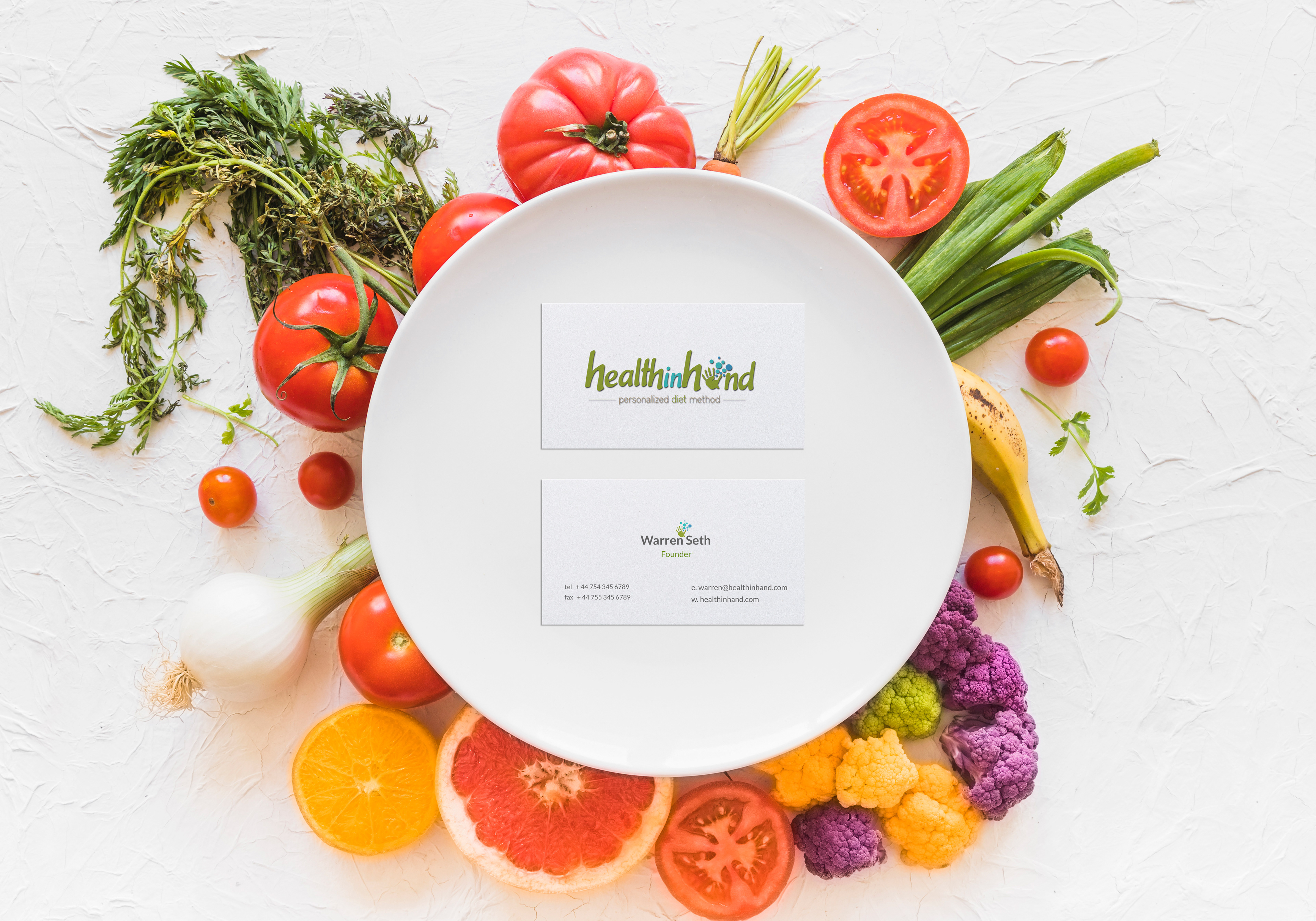
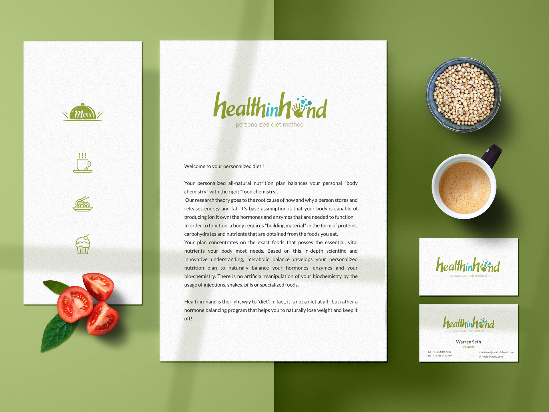
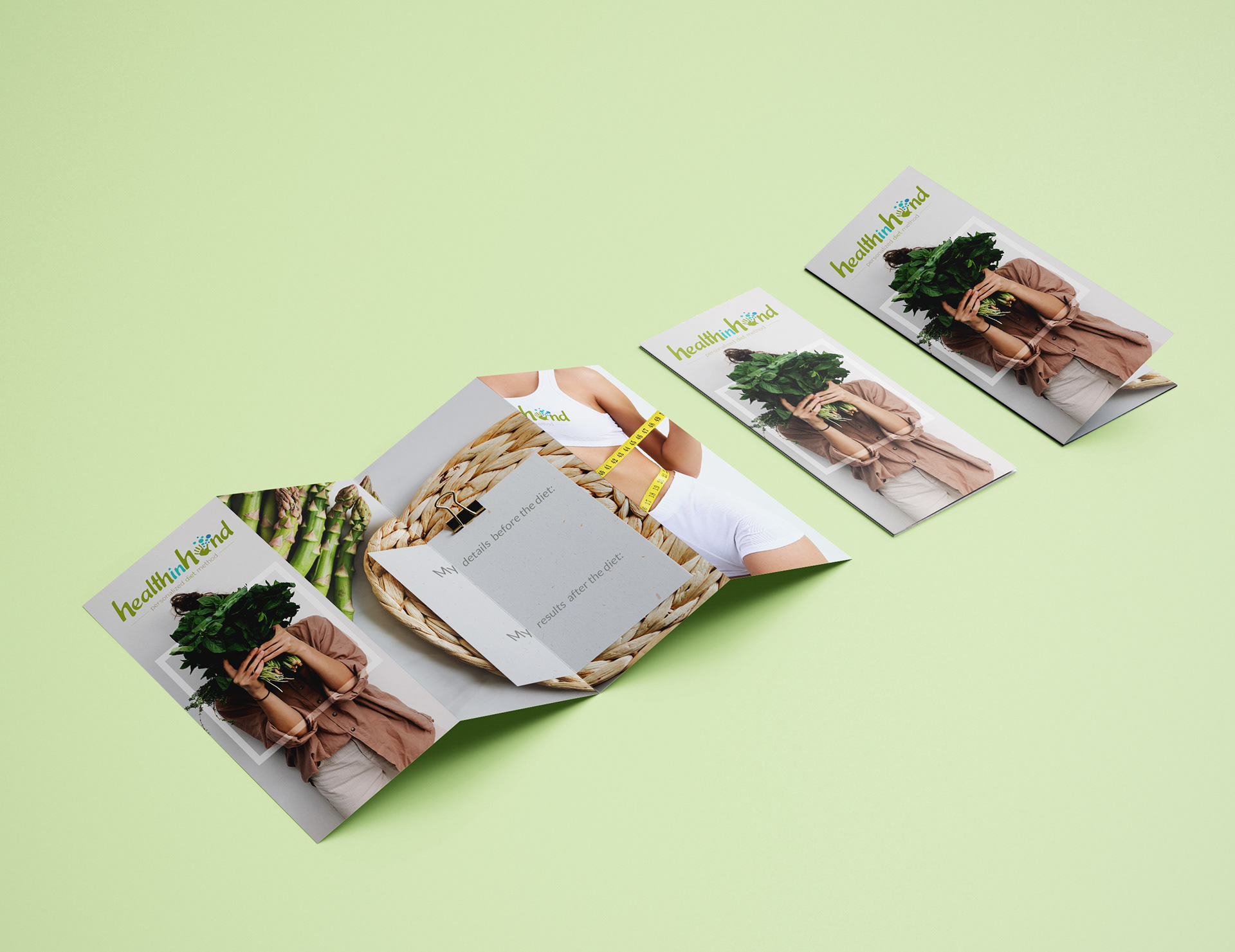
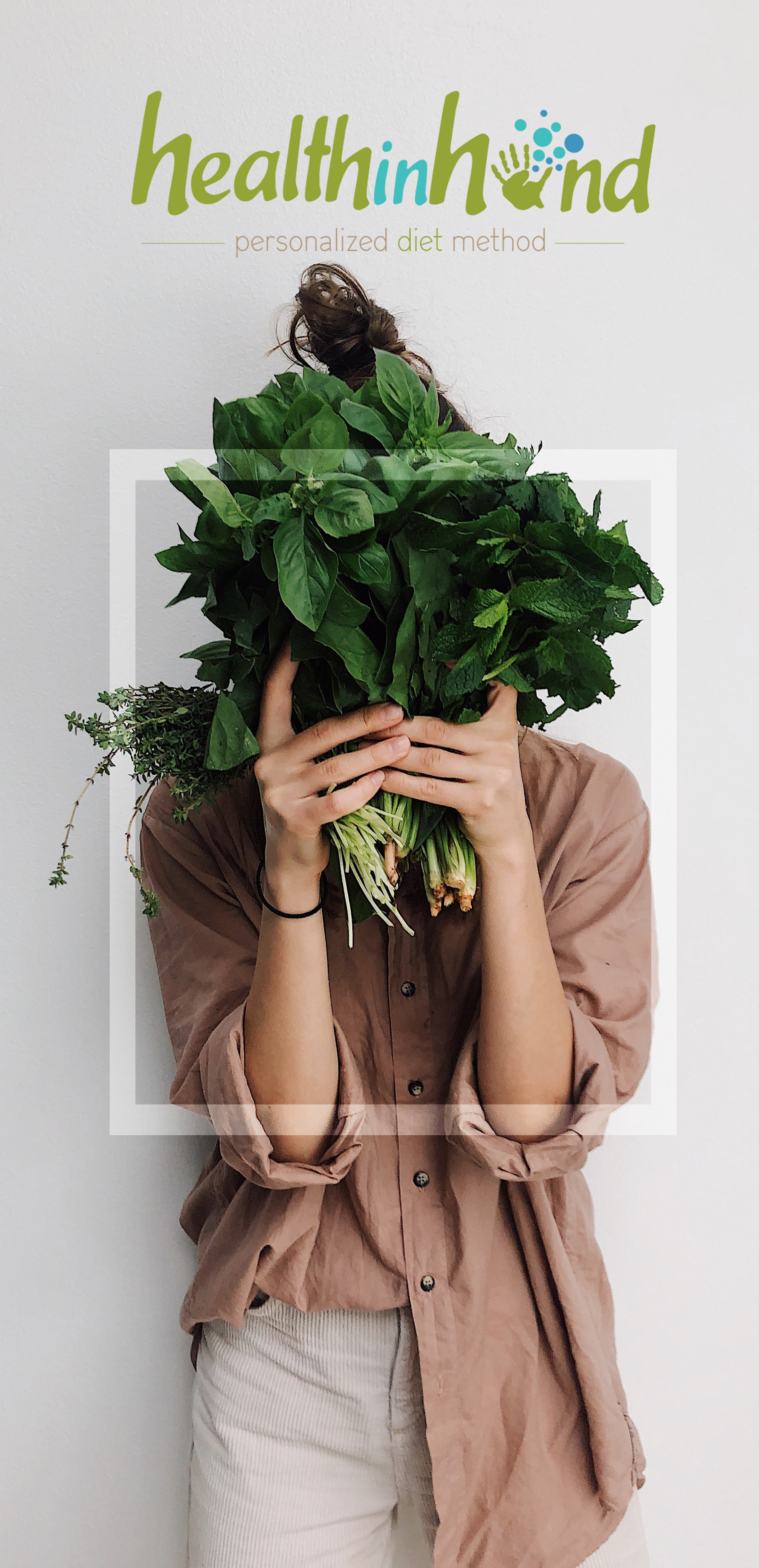
HEALTH IN HAND

In shaping this identity, my objective was to illustrate the effectiveness of a diet plan that targets individuals' specific hormonal profiles, emphasizing the significance of thorough blood analysis.


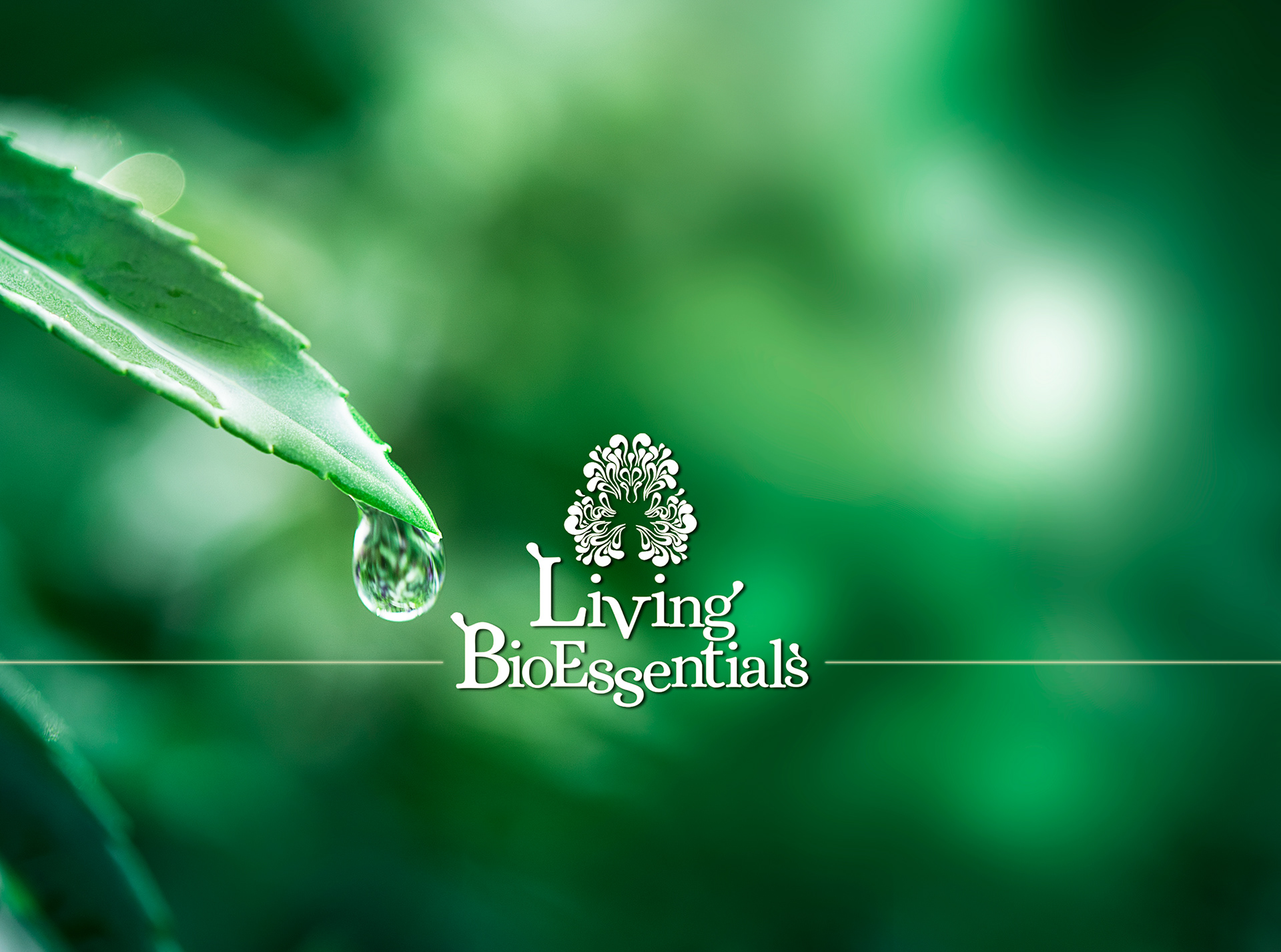
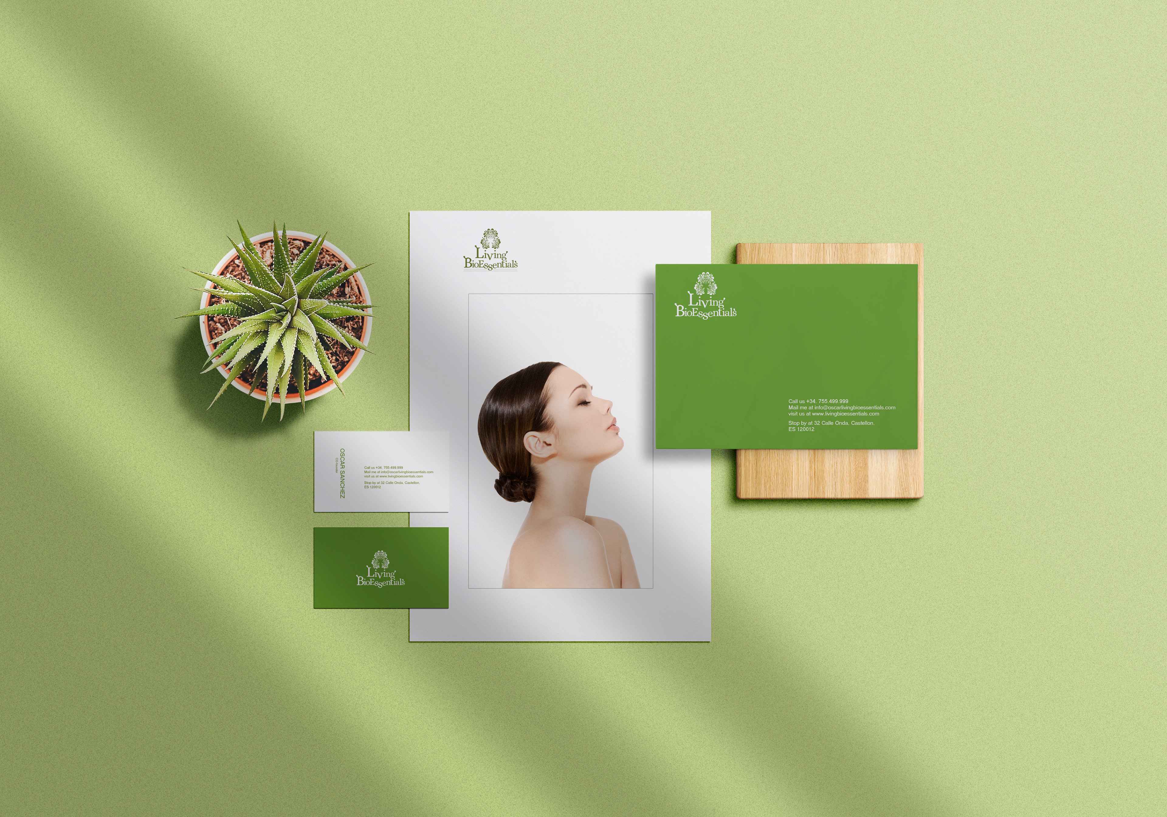
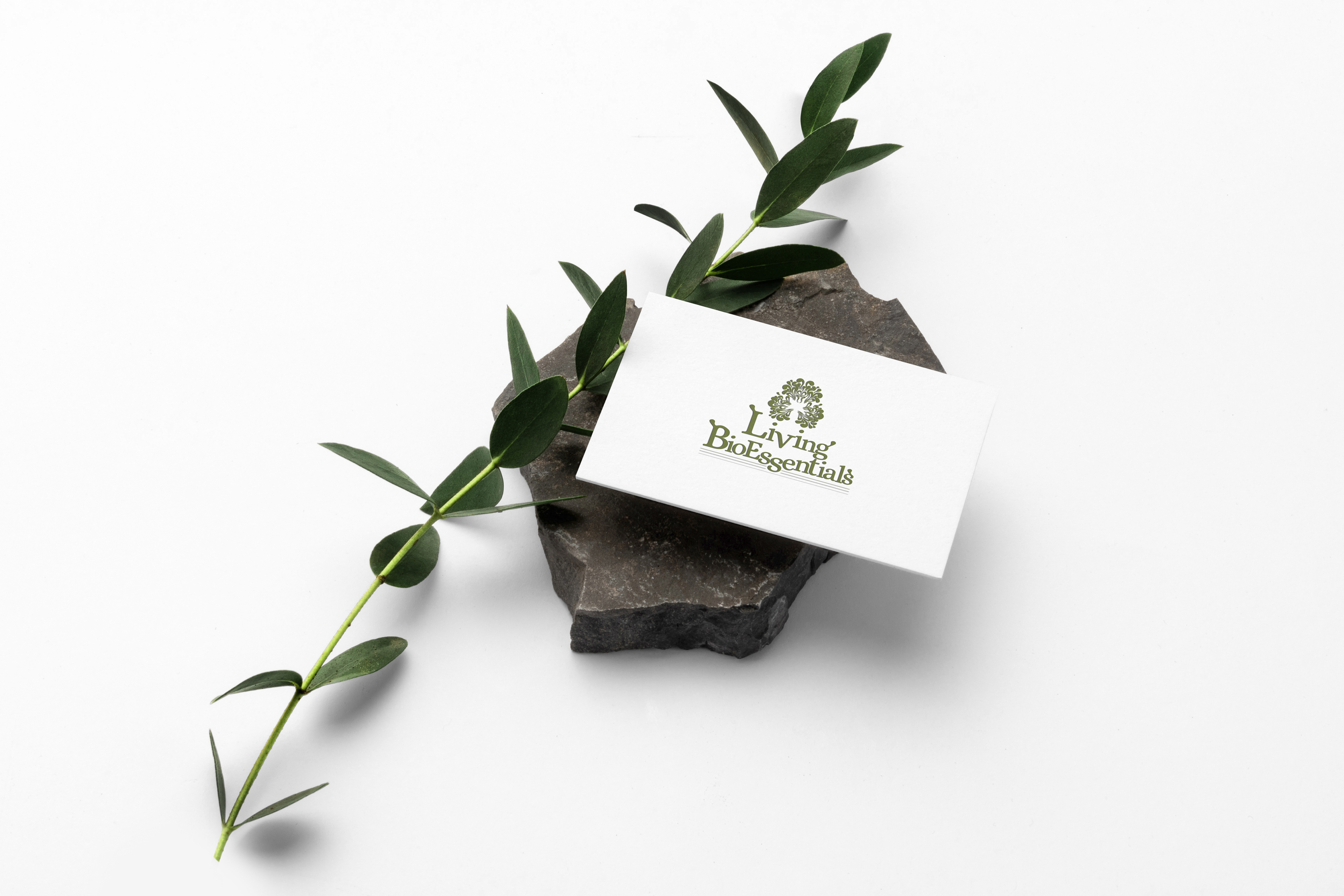
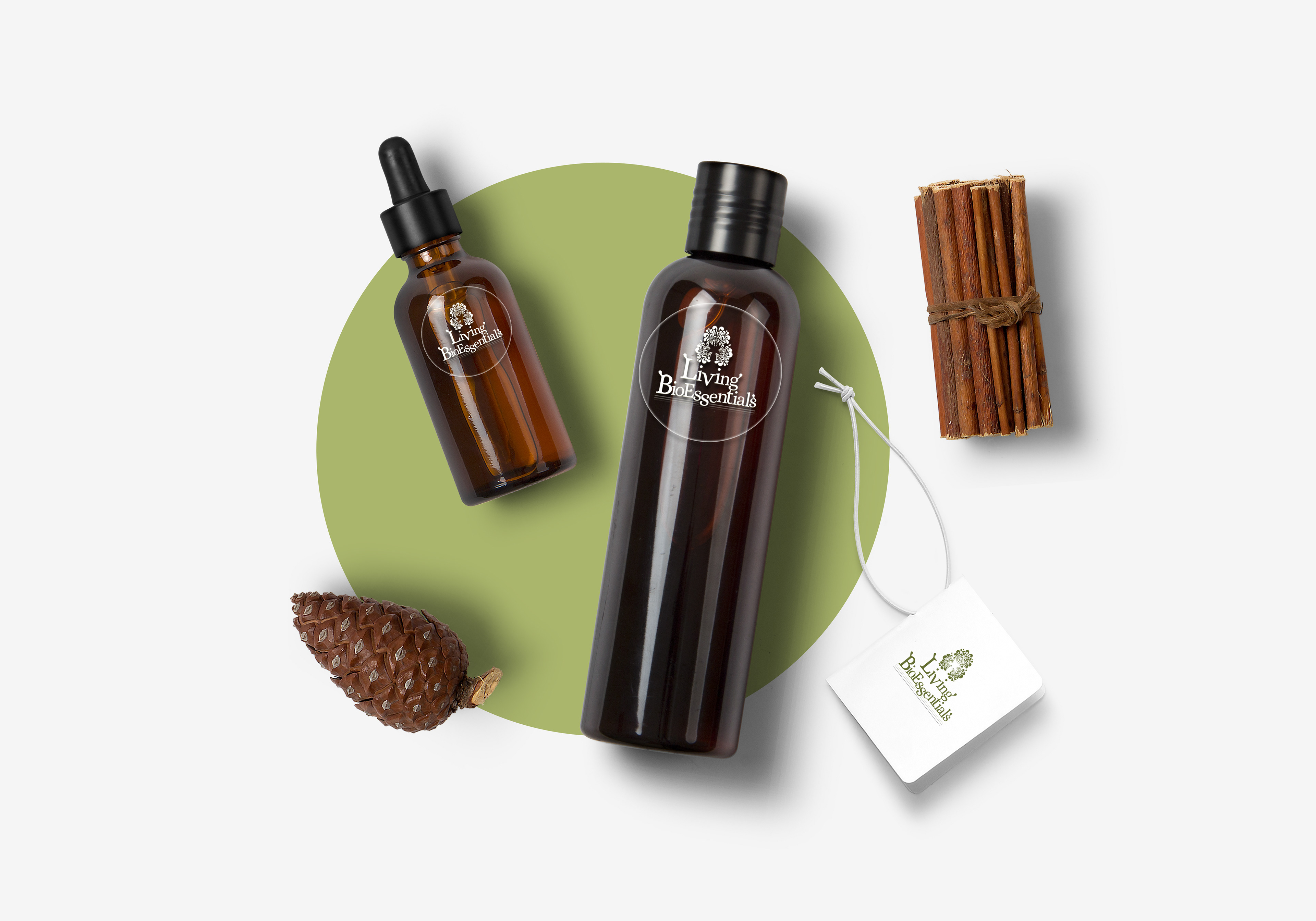
Thoughtfully curated in partnership with the client, this identity vividly portrays the dynamic vitality of bio oils sourced from the vibrant Spanish lands, providing a natural remedy that embodies liveliness for both health and home.